Japanese content
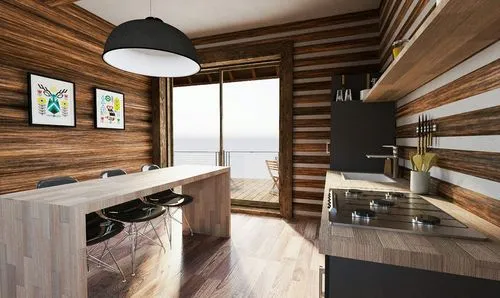
The Balcony Suites are luxurious accommodations offering balcony access with scenic views onto the old town.
Cabins
Amenities
Our Partners
About Us
FAQ
Inquire
Menu
Close
ja
ja
en
Book Now
ja
ja
en
Book Now
/* * Breakpoints */ $breakpoints: ( 'thumb': 'screen and (min-width: 480px)', //sm - tailwind 'lap': 'screen and (min-width: 768px)', //md - tailwind 'desk': 'screen and (min-width: 992px)', //lg - tailwind 'widescreen': 'screen and (min-width: 1280px)', //xl - tailwind 'widescreen-4k': 'screen and (min-width: 1536px)', //2xl - tailwind ); @mixin mq($alias) { // Search breakpoint map for alias $query: map-get($breakpoints, $alias); // If alias exists, print out media query @if $query { @media #{$query} { @content; } } @else { @error 'No breakpoint found for #{$alias}'; } } body { &::before { content: 'thumb'; display: none; visibility: hidden; @include mq(lap) { content: 'lap'; } @include mq(desk) { content: 'desk'; } @include mq(widescreen) { content: 'widescreen'; } @include mq(widescreen-4k) { content: 'widescreen-4k'; } } } // ----------------------------------- /* Accessibility */ .sr-only { position: absolute; width: 1px; height: 1px; padding: 0; margin: -1px; overflow: hidden; clip: rect(0, 0, 0, 0); white-space: nowrap; border-width:0; color: #000; } .sr-only:focus { position: static; width: auto; height: auto; padding: 0; margin: 0; overflow: visible; clip: auto; white-space: normal; border: solid 1px black; position: absolute; top: 0; left: 0; z-index: 999; } /* Set color style to inherit */ .inherit-color * { color: inherit; } /* Focus state style for keyboard navigation for the focusable elements */ *[tabindex]:focus-visible, input[type="file"]:focus-visible { outline: 0.125rem solid #4d65ff; outline-offset: 0.125rem; } /* Prevent all click and hover interaction with an element */ .pointer-events-off { pointer-events: none; } /* Enables all click and hover interaction with an element */ .pointer-events-on { pointer-events: auto; } /* Create a class of .div-square which maintains a 1:1 dimension of a div */ .div-square::after { content: ""; display: block; padding-bottom: 100%; } /* Make sure containers never lose their center alignment */ .container-medium,.container-small, .container-large { margin-right: auto !important; margin-left: auto !important; } /* Make the following elements inherit typography styles from the parent and not have hardcoded values. Important: You will not be able to style for example "All Links" in Designer with this CSS applied. Uncomment this CSS to use it in the project. Leave this message for future hand-off. */ /* a, .w-input, .w-select, .w-tab-link, .w-nav-link, .w-dropdown-btn, .w-dropdown-toggle, .w-dropdown-link { color: inherit; text-decoration: inherit; font-size: inherit; } */ /* Apply "..." after 3 lines of text */ .text-style-3lines { display: -webkit-box; overflow: hidden; -webkit-line-clamp: 3; -webkit-box-orient: vertical; } /* Apply "..." after 2 lines of text */ .text-style-2lines { display: -webkit-box; overflow: hidden; -webkit-line-clamp: 2; -webkit-box-orient: vertical; } /* Adds inline flex display */ .display-inlineflex { display: inline-flex; } /* These classes are never overwritten */ .hide { display: none !important; } @media screen and (max-width: 991px) { .hide, .hide-tablet { display: none !important; } } @media screen and (max-width: 767px) { .hide-mobile-landscape{ display: none !important; } } @media screen and (max-width: 479px) { .hide-mobile{ display: none !important; } } .margin-0 { margin: 0rem !important; } .padding-0 { padding: 0rem !important; } .spacing-clean { padding: 0rem !important; margin: 0rem !important; } .margin-top { margin-right: 0rem !important; margin-bottom: 0rem !important; margin-left: 0rem !important; } .padding-top { padding-right: 0rem !important; padding-bottom: 0rem !important; padding-left: 0rem !important; } .margin-right { margin-top: 0rem !important; margin-bottom: 0rem !important; margin-left: 0rem !important; } .padding-right { padding-top: 0rem !important; padding-bottom: 0rem !important; padding-left: 0rem !important; } .margin-bottom { margin-top: 0rem !important; margin-right: 0rem !important; margin-left: 0rem !important; } .padding-bottom { padding-top: 0rem !important; padding-right: 0rem !important; padding-left: 0rem !important; } .margin-left { margin-top: 0rem !important; margin-right: 0rem !important; margin-bottom: 0rem !important; } .padding-left { padding-top: 0rem !important; padding-right: 0rem !important; padding-bottom: 0rem !important; } .margin-horizontal { margin-top: 0rem !important; margin-bottom: 0rem !important; } .padding-horizontal { padding-top: 0rem !important; padding-bottom: 0rem !important; } .margin-vertical { margin-right: 0rem !important; margin-left: 0rem !important; } .padding-vertical { padding-right: 0rem !important; padding-left: 0rem !important; } /* Apply "..." at 100% width */ .truncate-width { width: 100%; white-space: nowrap; overflow: hidden; text-overflow: ellipsis; } /* Removes native scrollbar */ .no-scrollbar { -ms-overflow-style: none; overflow: -moz-scrollbars-none; } .no-scrollbar::-webkit-scrollbar { display: none; } /* Navigation */ // Nav lang dropdown .nav_dropdown-toggle.w--open { .nav_dropdown-icon { transform: rotateX(180deg); } } .nav_dropdown-icon { transition: transform .3s ease; } // Menu button open style .nav_button-text.is-close { display: none; } .nav_button.w--open { .nav_button-text.is-open { display: none; } .nav_button-text.is-close { display: block; } } /* Buttons */ // Button with left arrow // .button.is-link.is-icon:hover { // svg { // transform: translateX(.25rem); // } // } .button.is-link.is-icon, .video-play-button { svg { transition: transform .3s ease; } } .video-play-button:hover { svg { transform: scale(1.1); } } /* Accordion */ svg.is-vertical { transition: transform .5s ease-in-out; } .accordion_header.is-active { svg.is-vertical { transform: rotateZ(0deg); } } /* form */ .form_radio-icon.u-gift-card.w-radio-input.w--redirected-checked ~ .form_radio-label { color: var(--base-color-brand--brand-secondary); } // /////////////////////////////// // ----- Start: Handle Jap + Eng texts h1, h2, h3, h4, h5, h6, [class*="heading-"] { em { text-transform: uppercase; font-family: podium-soft-variable, sans-serif; font-weight: 400; font-stretch: extra-condensed; font-style: normal; letter-spacing: 0; strong { font-stretch: semi-condensed; } } strong em { font-stretch: semi-condensed; letter-spacing: 0; } &.cabin_title, &.cabin-popup_title { em { font-stretch: semi-condensed; strong { font-stretch: extra-expanded; } } strong em { font-stretch: extra-expanded; } } } .heading-english { strong { font-stretch: semi-condensed; font-weight: 400; } } .cabin_title, .cabin-popup_title { .heading-english { font-stretch: semi-condensed; strong { font-stretch: extra-expanded; font-weight: 400; } } } .text-rich-text { em { font-style: normal; font-weight: 500; letter-spacing: -0.01em; font-family: neue-haas-grotesk-text, sans-serif; } } // ------- End // Cabins .bullet-point-content { display: inline; } // Amenities // nav fallback .image-content-list_nav-wrap { top: calc(100vh - 2rem); top: calc(100dvh - 2rem); } @media screen and (min-width: 768px) { .amenity-group { .image-content-list_item:last-child { .image-content_component { margin-top: -4rem; transform: translateY(4rem); } .section_image-content { overflow: visible; } .padding-global { padding-bottom: 0; } } &[image-first="true"] { .image-content-list_item:nth-child(odd) { .image-content_component { flex-direction: row; } } .image-content-list_item:nth-child(even) { .image-content_component { flex-direction: row-reverse; } } } } } // FAQs .faq_question.accordion_header { &.is-active, &.is-active + * { opacity: 1; } } // Partners .text-rich-text.two-col-text_cta { a { text-decoration: none; } } // Manage Line Breaks .highlighted-heading { .w-richtext p { display: inline; @media (max-width: 991px) { display: block; } } } .section_hero .hero_text-content { [class*="heading-"].w-richtext, [class*="heading-"] .w-richtext { @media (max-width: 479px) { p { display: inline; } } } } .section_hero .hero_text-content { [class*="heading-"] br { @media (max-width: 479px) { display: none; } } } // MAP .map-iframe_wrap { position: relative; width: 100%; height: calc(100vh - 3rem); overflow: hidden; } .map-iframe_wrap iframe { position: absolute; top: 0; left: 0; width: 100%; height: 100%; border: 0; filter: grayscale(100%); } // Contact .accordion_header.is-active .accordion_icon { transform: rotate(180deg); } input { color: inherit; font-size: inherit; } // //////////////////////////// // ORPHANS ///////////////// //////////////////////////// body { text-wrap: pretty; } /////////////////////////////////////// // LOCALIZATION that are quite difficult to do on the designer ///////////////////////////////////////// html[lang="en"] { body { font-family: neue-haas-grotesk-text, sans-serif; font-size: 1rem; font-weight: 400; letter-spacing: 0; } h1, h2, h3, h4, h5, h6, [class*="heading-"], .button { font-family: podium-soft-variable, sans-serif; font-weight: 400; font-stretch: normal; strong { font-weight: 400; font-stretch: extra-expanded; } } h1, .heading-style-h1 { font-stretch: semi-condensed; } .hero_title { font-stretch: semi-expanded; .hero_title-line-1 { font-stretch: extra-condensed; } } @media screen and (max-width: 479px) { .hero_title { font-size: clamp(1.5rem, -0.857rem + 11.429vw, 2rem); } .hero_title-line-1 { font-size: clamp(1.25rem, 0.071rem + 5.714vw, 1.5rem); } } h2, .heading-style-h2 { font-stretch: normal; } h3, .heading-style-h3 { font-stretch: semi-condensed; } @media screen and (min-width: 992px) { .large-text_title-first[smaller-line-1="true"] { font-size: 3.75rem; } } .large-text_title-first[compressed-line-1="true"] { font-stretch: semi-condensed; } .section_hero .hero_text-content [class*="heading-"] { font-stretch: extra-condensed; strong { font-weight: 400; font-stretch: semi-condensed; } } .large-cta_title { .large-cta_title-wide { font-stretch: extra-expanded; } .large-cta_title-normal { font-stretch: semi-condensed; } @media screen and (max-width: 991px) { font-size: clamp(4rem, 0.571rem + 7.143vw, 5rem); } @media screen and (max-width: 767px) { font-size: clamp(2.4rem, 1.4rem + 3.333vw, 3rem); } @media screen and (max-width: 479px) { font-size: clamp(1.6rem, 0rem + 8vw, 2.4rem); } } .button { font-stretch: semi-condensed; font-size: 1rem; letter-spacing: 0.05em; text-transform: uppercase; } .button.is-link { font-family: neue-haas-grotesk-text, sans-serif; font-stretch: normal; letter-spacing: 0; text-transform: none; } .cabin, .cabin-popup, .section_floating-booking-button.is-cabin-page { .button:not(is-link) { letter-spacing: 0.05em; font-stretch: expanded; } } .text-rich-text.u-legal { h1, h2, h3, h4, h5, h6 { font-weight: 400; strong { font-stretch: inherit; } } } } html[lang="en"], html[lang="ja"] { // this is now default for both locales .navbar { .button.is-link { font-family: podium-soft-variable, sans-serif; font-weight: 400; font-size: 0.875rem; font-stretch: expanded; letter-spacing: 0.05em; text-transform: uppercase; } } }
森の宿を予約する
FAQs
チェックインとチェックアウトの時間は?
ペットと一緒に泊まれますか?
駐車場はありますか?
キャビン内での喫煙は可能ですか?
サブスクリプションの仕組みを詳しく教えてください。
サブスクリプションの一時停止や解約はできますか?
サブスクリプション料金以外に追加料金はかかりますか?
サブスクリプションの宿泊権利を他人に譲ることはできますか?
食事は宿泊料金に含まれていますか?
薪や炭はありますか?